Flying High – A Video Editing Trip To Stunning Milan
Recently, Little Bird Emma had a video editing job that took her all the way to Italy! Here, she tells us all about it…
Think “accessibility” doesn’t apply to you? Think again!
It’s never been more important to ensure that your digital content is widely accessible. Making the changes necessary to bring your website to a broader audience might seem daunting, but we’re on hand to help, starting right at the beginning…
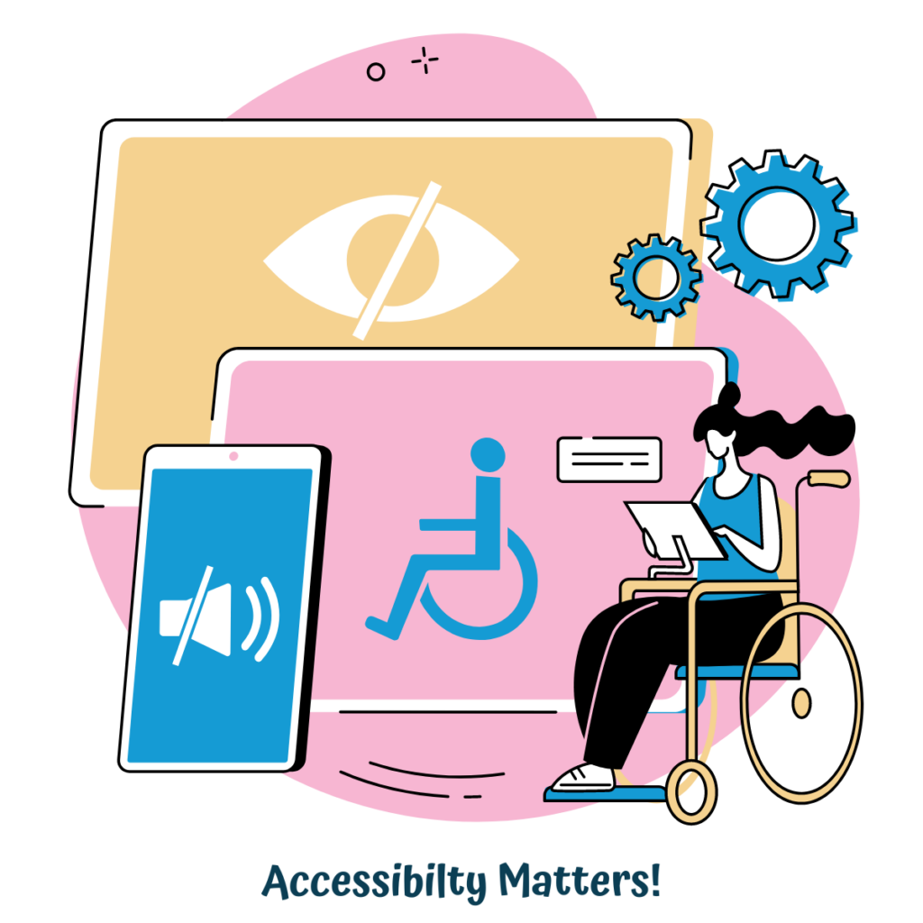
In digital terms, “accessibility” refers to whether or not a person with a disability can easily acquire the same information, engage with your content and make the most of the same services as a person without a disability.
This means that your website (and all online content) needs to feature inclusive design that works to eliminate the barriers that can block a user’s access. Accessible web design should work for everyone, including users with visual, cognitive, physical, and auditory disabilities.
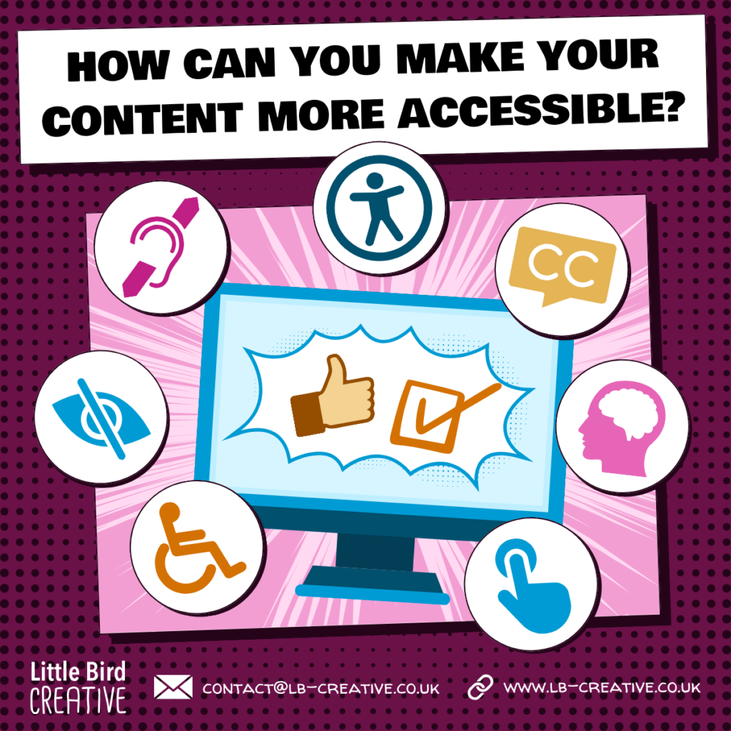
Thankfully, accessible web design can be achieved far more easily than you might think! You might want to start by analysing your current website using an online accessibility checker. Alternatively, you can get in touch and we’ll be happy to take a look at your site and give you some feedback on how you could improve accessibility. Of course, Little Bird Creative are happy to then implement some of the changes necessary to ensure your site can be used by the widest audience possible, but if you’re keen to do it yourself, we have a few top tips that we’re happy to share…
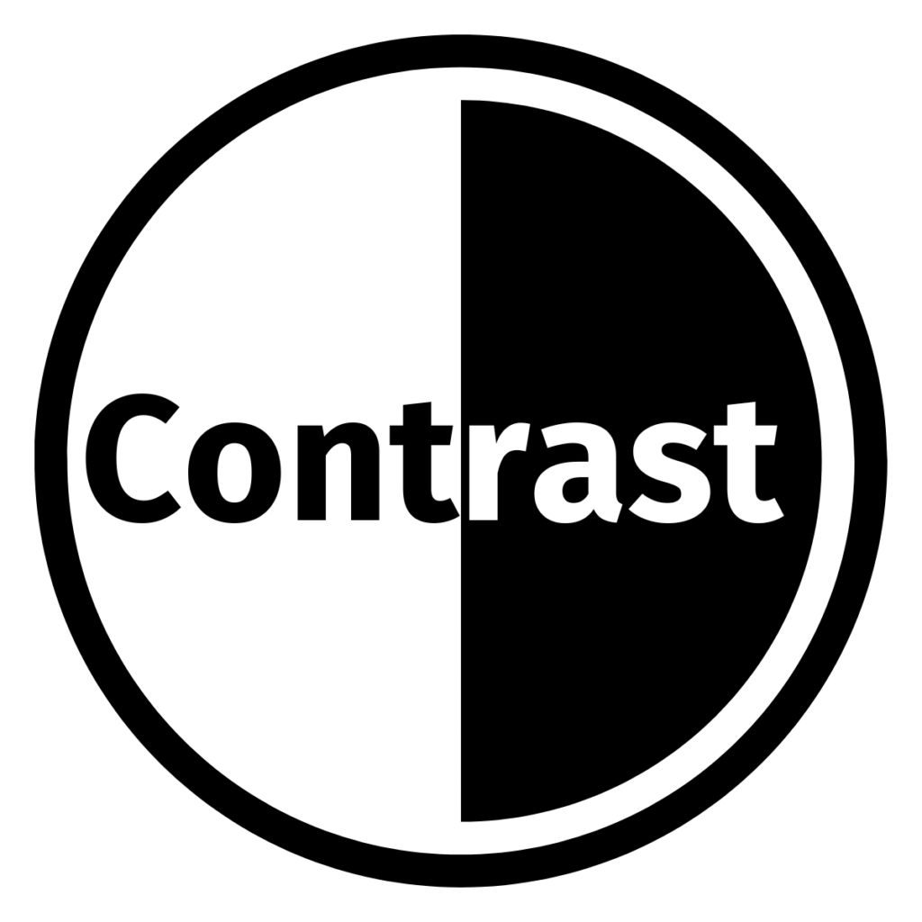
Accessible web design means considering the colours you use. The colour contrast between the text and background of your website is important, as it affects some people’s ability to read the information you’re trying to share. Again, there are online platforms you can use to check the contrast levels on your website.
You should never rely solely on colour to indicate anything on your site. For example, if you have interactive surveys built in, make sure you have text saying “yes” and “no” on the buttons, rather than simply making them different colours, e.g. green for yes and red for no.
It’s also crucial that text is legible. Complex, swirly fonts might look interesting, but if nobody can read them, there’s no point using them. Similarly, never place text over a busy background, as it can make it very hard to read, even without any kind of visual impairment.

If you have video content on your site, you should ideally have closed captions in place, so that those who are unable to hear the audio are able to read what’s being said, instead. This goes beyond subtitles, to include sound effects and music. You may have “[upbeat music plays]” during a section of the video without speech, for example.
Accessible web design also requires you to use ALT text for any images you use, so that anyone using a screen reader to access your site can have the imagery described to them. ALT text has the added bonus of being really good for SEO, so don’t forget to add it!
As well as ensuring that the font you use on your website is legible, the actual copy itself needs to be accessible to all users. That means writing in plain language so that it’s clear and simple to understand. Avoid jargon, don’t use acronyms unless you explain what they mean the first time they appear (on every page!) and avoid using too many colloquial references – remember that your copy is available to a global audience!
Structure your copy with clear headlines and break up large chunks into smaller, easier-to-read segments – nobody wants to be faced with a great big wall of text when they visit a website, after all!
A clean layout, with legible text and simple language is a great place to start, when it comes to accessible web design. Keep your menu easy to navigate, with headings that make sense – you might think “Meet The Head Honcho” is a funny label that sets your company apart, for example, but “About Me” is far simpler to understand and therefore more accessible.
Check your copy for grammatical or spelling errors and keep images on topic and in keeping with the tone of your site. Consistency and clarity are key!
It’s also always a good idea to check your site’s responsiveness – if it works on a desktop but not on an iPad, something needs to be tweaked!
We hope we’ve shared a few tips to get you started, but if accessibility is something you’d rather outsource, we’re always happy to help – get in touch and we’ll ensure your content is accessible to the widest audience possible!
Recently, Little Bird Emma had a video editing job that took her all the way to Italy! Here, she tells us all about it…
With the rise of self-publishing, anyone can become an author, but the path to print success can be tricky to navigate. Thankfully, if you’ve got a story to tell, we’re on hand to help bring it to life!
We say it a lot: people buy from people! So, honing your people skills and building strong client relationships are vital.
Summer will be here before you know it. Is your organisation ready to make the most of it?!